Comparing App Recommendation Systems
Project Year: 2020-2021
Project Goal: Develop and compare two interactive systems to recommend mental health mobile apps compared against the app store
Research Questions:
- Does providing recommendations ease decision-making?
- Do users prefer searching for apps on their own or being guided?
- How trustworthy do users find third-party app recommendations?
- What information do users want when making download decisions?
Methods Used: User Personas (design + testing), Competitive Analysis, Task Analysis, Interviews, Moderated Usability Test
- Within-Subjects design (n = 16, average age = 30.1) where participants were randomized into one of three personas to find a suitable app for.
- Think-Aloud Task Analysis. Participants attempted to select an app that fits the persona with each of three search methods: chatbot recommender prototype, website recommender prototype (read more about the design process in this project), and the App Store (control).
- Moderated usability test with participant screen sharing.
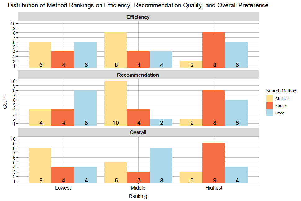
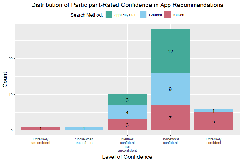
- Participants rated methods on: Usability (UMUX scale), Confidence in app selected, Search method efficiency, Quality of recommendations, Overall preference
- Semi-structured interview to conclude
Task Instructions: Imagine you are a college student and have lately been experiencing an increase in stress and pressure. You are juggling numerous responsibilities and are struggling to manage feelings of overwhelm while dealing with remote school and your impending graduation. Your feelings of anxiety about your grades and the future have made it difficult for you to engage in self-care activities or stress relief. Recently, your conversations with friends revolve around all of your stress and financial concerns rather than fun and relaxed topics. Please find an app that could be helpful for you to cope with these feelings.
Results
App Store
- Users were less confident in their app decisions (25% did not choose an app)
- Too many results, and filtering options aren’t granular enough
- Users were unsure where to start when choosing search terms
Web Prototype
- Ranked highest across categories
- Domain specificity provides the illusion of expertise, so people trusted it more
Chatbot Prototype
- Variability in preference off the bat
- Users did not have a broad sense of the app space
- Felt somewhat like a black box due to so few questions

Design Implications
A conversational app recommender reduces decision overload and expedites app selection.
Does providing recommendations ease decision-making? How many recommendations is sufficient?
- Users like recommendations, but not too many
- Between 3 and 8 is sufficient
- Many apps + long descriptions = information overload
Do users prefer searching for apps on their own or being guided?
- There was little browsing of app stores. Users go to the app store when they know exactly what they want (e.g., Spotify, Instagram).
- Chatbot was nice as an optional assistant
- Recommendations are nice when users are uncertain about what app to download
How trustworthy do users find third-party app recommendations?
- Domain specificity is helpful and adds credibility
- Chatbot was less trustworthy, somewhat of a black box
- App store is less trusted, apps can buy reviews, promote their app

