Recommender System Conversation Design
App Background
Users of mobile apps for mental health are seeking low-cost, stigma-free solutions that are readily accessible and provide support and treatment recommendations. Apps are not a panacea but may provide help to those without other options. There is a clear need for unbiased information on MH apps and third-party systems can provide this. Current app analysis sites have limitations and finding a suitable app on these sites or the app stores can be overwhelming. Providing users with recommendations can increase the speed of decision making [1], but pior app recommender systems have required user app history to make recommendations [2,3]. Task-oriented conversational agents can interact with customers helping them find items or services more effectively [4].
There are currently a small number of academic websites that conduct expert evaluations of mental health apps, but these are ineffective due to constantly evolving apps making site information obsolete as well as the costs involved in generating expert reviews. These sites allow filtering based on several factors, but do not provide personalized options on a user-by-user basis. We developed two rule-based chatbots for providing mental health app recommendations.
Project Goal: Develop a chatbot system to recommend mental health mobile apps and quickly reduce a large set of apps to a handful of personalized options.
Project Year: 2020-2021

Chatbot Development
The text-based chatbot prototype, AppBot, was designed using Botsociety, an interface designer for conversational systems. Botsociety provides quick high-fidelity modeling of conversation paths and has multiple integration options (e.g., Slack, Messenger, Google Assistant), including embedding directly into websites. Botsociety allows for integration with Google’s Dialogflow system, which would allow for an NLP-backed chatbot system. With this development environment, we have the option of creating a text-based agent or voice assistant which would make the final system more accessible and flexible for a varied user-base.
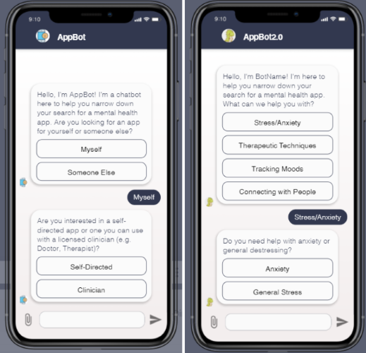
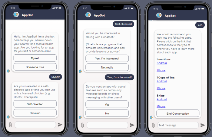
Based upon our pilot interviews and app store analysis, we decided on two models: Need-based and feature-based. We developed two chatbots in Botsociety following the need-based and feature-based model (shown above). The feature-based model offered more flexibility and relevance to a broader set of users so we decided on testing this one with out pilot users. The final prototype shown below depicts the deployed chatbot system and an example of the recommended apps.
Methods used: Competitive Analysis, Conversational Design, Decision Trees, A/B Testing

Background
As part of a larger project exploring how people search for apps and how to improve their experience, we designed two systems to provide users with personalized suggestions. To test another method of app recommendation (aside from the chatbot project below), we also prototyped a more traditional website interface that acts as an alternative to the traditional app stores. We implemented a small set of initial questions to filter apps for presentation to the user. Users are then able to see how well apps match their wants, filter based on features, and view a subset of relevant user reviews.
Project Goal: creating a better search experience than the App/Play Stores
Project Year: 2020-2021

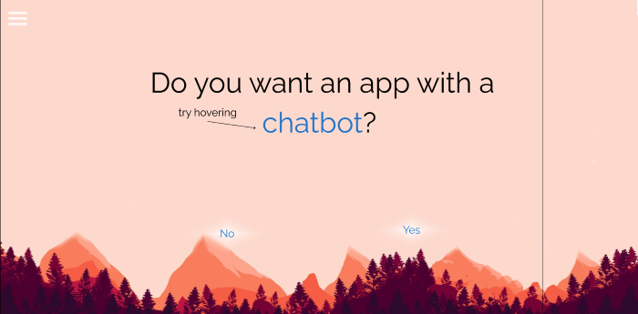
Figure 1: A frame from the initial interactive search where user preferences are elicited
Prototype Development
Our initial design considerations stemmed from our goal of creating a better search experience than the App/Play Stores. We conducted competitive analyses of the app stores as well as two academic app review websites to identify areas for improvement. We began with the idea of a website that built on the familiar interface and experience of searching app stores while also incorporating transparency around features and functionality as with Psyberguide and MIND Apps. The academic websites had several weaknesses that we wanted to address in our design. Notably, they provided a level of information that would be overwhelming to target users and the expert review process seemed more suited for clinicians interested in recommending validated apps to their patients. A pitfall of the academic website’s reliance on expert reviews islies in the time intensive nature of providing such analyses and the speed at which they can become outdated due to app updates. However, we chose to incorporate expert reviews in our design to explore whether users found them useful or unnecessary.
Our system, Kaizen, was designed in Figma, a free, collaborative interface design tool commonly used in UI design and prototyping. Kaizen has two components, an interactive search that walks users through eight questions asking about their preferences (Figure 1), and an app presentation page that displays eight relevant apps to users based on their responses. The app presentation page displaysed the percent match between a user and an app, and includesed a sidebar with editable app filters such as price and features included. Users are then able to see how well apps match their wants, filter based on features, and view a subset of relevant user reviews. Each app could be hovered over to see the percent match (Figure 2) and clicked on to bring users to a larger description of the app akin to those of the app stores. These pages included traditional information such as developer descriptions and screenshots of the user interface, but was updated to include an in-depth breakdown of user reviews. Reviews were separated into positive and negative tabs (Figure 3) and further categorized under headings pertaining to content extracted from user reviews (e.g. reviews that discuss Sleep or Meditations). We explore the potential utility of user review analysis to extract information to estimate and score the effectiveness of relevant app features. To compare with other app review websites, we also included fictional expert reviews by clinicians to ideate and test user interest in scientific validation of apps.
You can test out Kaizen here
Methods and tools used: Wireframing, User Personas, Paper Prototyping, Figma

Figure 2: The presented set of eight apps. Hovering displays the percent match with the user’s initial responses

Figure 3: Reviews were separated into positive and negative tabs and further categorized under headings pertaining to content extracted from user reviews (e.g. reviews that discuss Sleep or Meditations).
References
- Theosaksomo, D., & Widyantoro, D. H. (2019, October). Conversational Recommender System Chatbot Based on Functional Requirement. In 2019 IEEE 13th International Conference on Telecommunication Systems, Services, and Applications (TSSA) (pp. 154-159). IEEE.
- Davidsson, C. (2010). Mobile application recommender system.
- Costa-Montenegro, E., Barragáns-Martínez, A. B., & Rey-López, M. (2012). Which App? A recommender system of applications in markets: Implementation of the service for monitoring users’ interaction. Expert systems with applications, 39(10), 9367-9375.
- Zou, J., Chen, Y., & Kanoulas, E. (2020). Towards Question-based Recommender Systems. arXiv preprint arXiv:2005.14255.
