Shiny Application
Background
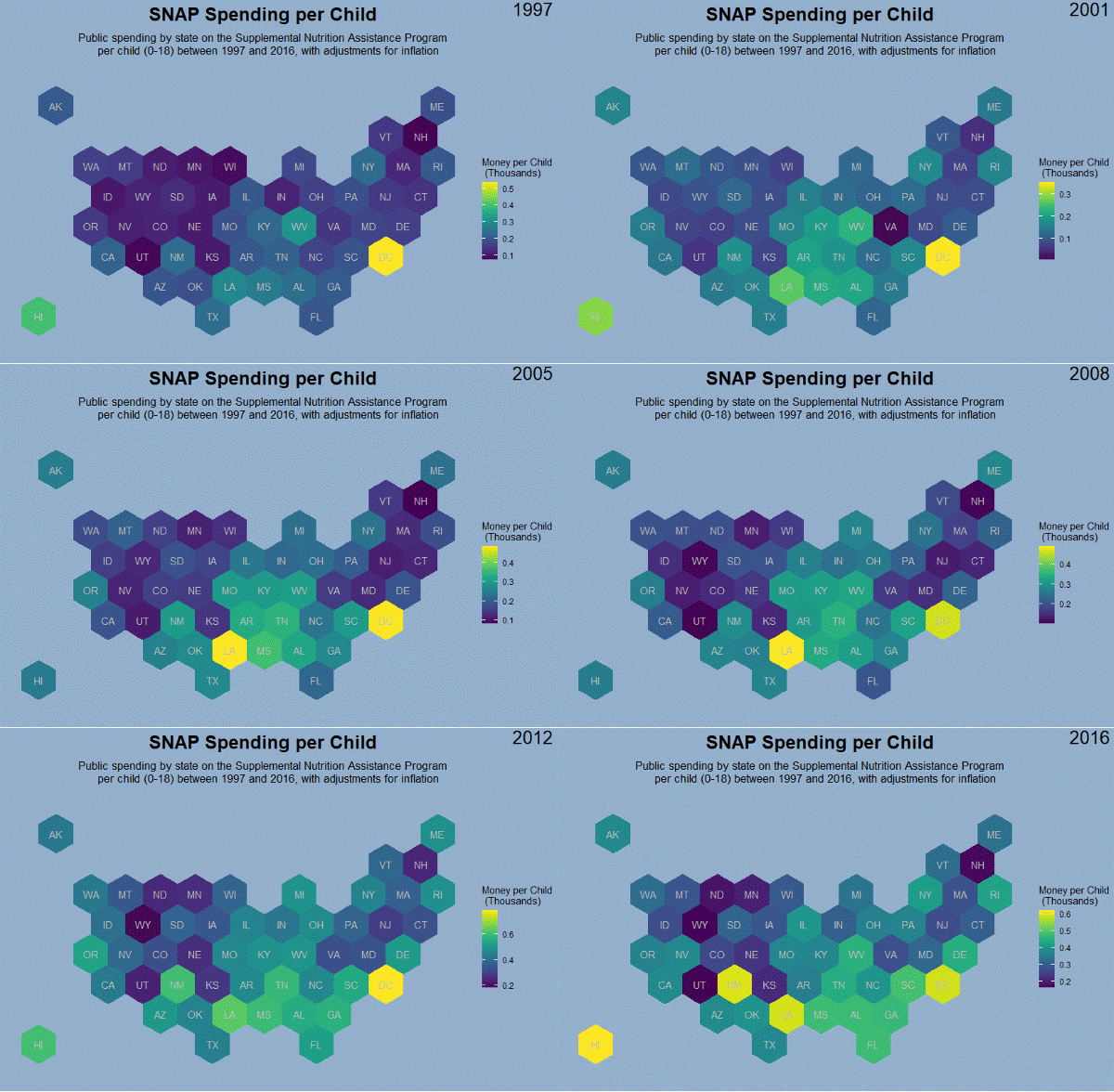
This project initially began as a static visualization I completed for the Tidy Tuesday weekly data challenge. Tidy Tuesday is a “weekly social data project in R” to practice data manipulation and presentation with the R programming language. Each week, a new dataset is provided for participants to work with and post their visualizations to the Tidy Tuesday Twitter community. I began participating in June 2020 to improve my R skills. The project described here is an extension of my submission for Tidy Tuesday on September 15, 2020. The dataset for this week was from Urban Institute and contained data on US Government spending on kids for various programs between 1997 and 2016. For this week, I made a GIF in ggplot2 - a package for creating data visualizations based upon the grammar of graphics - of the money spent on SNAP (Supplemental Nutrition Assistance Program) by each state on a per child basis. The gif displays the spending broken down by year from 1997-2016 (see Figure 1).
To extend this project, I wanted to make an interactive app to explore the dataset further. For my initial visualization, I only focused on one area of spending (SNAP), but there are many other variables to explore (e.g., education spending, Pell Grants, Medicaid). Shiny, described further below, is a framework for developing interactive web apps in R. The goal of this project was to develop a shiny web application that allowed for further exploration and visualization of the Government Spending dataset.

Project Goal: Code an interactive Shiny web application to explore the US Government Spending on Kids dataset through an interactive map display
Project Year: 2022
Coding the App
Data
To code the app, I started with the government spending data. First, I loaded the data into R and inspected it. The data was already in a usable format aside from the need to convert some variables into factors - variables with predefined levels (i.e., factors group similar values for plotting, so a factor called gender may contain the levels man, woman, non-binary, trans, etc. rather than characterizing them as string values. Numbers can also be treated as levels versus numeric values which can make plotting things like years easier). Factors are always discrete variables, compared to our discussion of continuous variables above.
Next, I moved on to the map data. I downloaded the geojson file with coordinates for the US states already defined. After cleaning the data and finding the center of each state’s hexagon, I combined the map data with the government spending data to have one final dataframe to work with. These datasets were combined using a left join, meaning that the two datasets were compared by their “state” column and then all the columns from both datasets that had row matches for the “state” value were included in the final dataset.

Visualization
As described above, {ggplot} provides functions for data visualization using geoms (geometric objects) to plot different shapes (e.g., geom_bar is used for bar charts, geom_point for scatter plots). In this plot, I am using geom_polygons which are plotted from data listing the coordinates of each polygon (positions on the plot). {ggplot} affords control over the smallest details of a plot and everything from the legend background and position to the axis ticks and margins can be altered to fit one’s vision. Aside from the polygon geom that plots the hexagon states, a text geom is used to plot the state abbreviation labels.
I found the hex map more visually interesting than the geographically correct US map when first ideating this plot. Another option would have been a leaflet map - a Javascript library for interactive maps - but I did not feel I needed the granularity a leaflet provides through its detail and zoom functionality. Much of the ggplot code came from my initial static visualization and was updated to include reactivity to user input.
User Interface
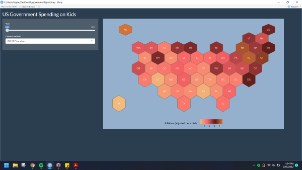
For the UI, I added three selections - a slider, a dropdown selection, and a radio selector (Figure 8). The slider allows users to change the year of the data that is plotted on the map. This ranges from 1997 to 2016, the years present in the dataset. The dropdown input selection lists all of the possible variables to plot as the fill color of the plot to indicate how much money was spent by each state. One variable can be chosen from a list of 23 different programs funded for children by the government. The final widget allows users to select the color palette for the fill color of the map. Five options are presented via single-select radio buttons. I wanted to try to implement a variety of options, so although the color selector is not vital to the display, it was interesting to work with.
Server
The server function is where I coded the ggplot visualization and converted the user input into a reactive. This means that whenever the input from the user changes, the related output is automatically updated and displayed on the plot. In this app, the data is filtered so that only years equal to the user selection are displayed (one year at one time) and the relevant factor level of the funding programs is used as the fill color for the map. Below is the code I used to create a new dataframe from the filtered data. You can see that the relevant variables (year and variable) are compared against the user’s input (input$var is the inputID from the UI). To render the plot, renderPlot() is called, the filtered data is passed in as a function that updates with any changes made to the input, and then this data is passed into the plot.
The figure below provides an example of the reactivity of the map. In the gif, the fill variable (funding program) is selected at PK -12 Education. The different frames of the gif show the changes made to the map when the year selection changes. The final code for the app can be seen here.

